How to Use Different Types of Style Sheets
You want to provide style sheets for different media types such as aural, print, and handheld.
Create separate external style sheets for the different media and name them by their media such as print.css, screen.css, and handheld.css. Then use the link element with the media type in the web page to link to these styles. Another option is to use the @media rule.
|
Here's print.css: body {
font: 10pt times, georgia, serif;
line-height: 120%
}
A new file called screen.css: body {
font: 12pt verdana, arial, sans-serif;
line-height: 120%
}
Then finally another file called projection.css: body {
font: 14pt;
line-height: 120%
}
Then link to the three files from the web page with the following lines within the head section. Each link has a different media type: <link rel="stylesheet" type="text/css" href="/css/print.css" media="print" /> <link rel="stylesheet" type="text/css" href="/css/screen.css" media="screen" /> <link rel="stylesheet" type="text/css" href="/css/projection.css" media="projection" /> You could use the @media rule instead to specific the different media rules within the same style sheet: <style type="text/css">
<!--
@media print {
body { font: 10pt times, georgia, serif }
}
@media screen {
body { font: 12pt verdana, arial, sans-serif}
}
@media projection {
body { font-size: 14pt }
}
@media screen, print, projection {
body { line-height: 120% }
}
-->
</style>
DiscussionWhen creating the styles for printing, add them to print.css and then only these styles are applied during printing. This ensures the page prints without wasting space or ink from printing the images. Only devices supporting the specific media type will see its related media CSS styles. The media style sheets don't affect the appearance of other media or the web page itself. The @media rule allows you to put all the media in one style sheet. Figure 1-32 shows how the web page looks in its original screen format. Users don't need to print the side items, so copy the screen.css style sheet and save it as a new one called print.css. Rather than starting from scratch, modify screen.css to optimize the web page for printing. The following items in screen.css have been changed in print.css. #sub_banner {
background-color: #ccc;
border-bottom: solid 1px #999;
font-size:.8em;
font-style: italic;
padding: 3px 0 3px 5px;
}
#nav1 {
position: absolute;
width: 30%;
left: 60%;
top: 100px;
padding: 5px 5px px 5px 0;
}
#nav2 {
position: absolute;
width: 15%;
left: 1%;
top: 100px;
padding: 5px 5px px 5px 0;
}
h1 {
text-align: left;
color: #fff;
font-size: 1.2em;
text-align: left;
margin-bottom: 5px;
margin-top: 5px;
}
.entry {
padding-bottom: 20px;
padding: 5px;
border: solid 1px #999;
background-color: #fcfcfc;
margin-bottom: 25px;
}
Figure 1-32. This is how the page would look if printed without print.css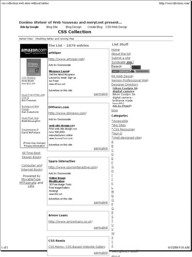
Figure 1-33 shows how they now appear with print.css: #sub_banner {
display: none
}
#nav1 {
display: none
}
#nav2 {
display: none
}
h1 {
display: none
}
.entry {
padding: 5px;
}
Figure 1-33. After creating print.css and adding a link to the style sheet, the web page is printer-friendly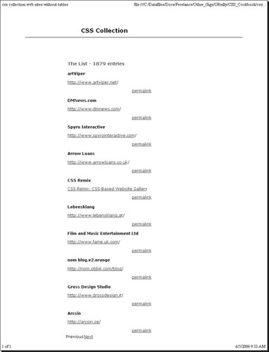
This takes out the sub-banner with the tagline and hides the two navigation columns. The h1 element wasn't necessary to have and removing it saved space at the top. The entries have a light gray box, a big waste of ink, so they've been simplified to show only the padding between entries. Remember to add the link element in the HTML page: <link rel="stylesheet" type="text/css" href="/css/print.css" media="print" /> <link rel="stylesheet" type="text/css" href="/css/screen.css" media="screen" /> That's all there is to it. CSS simplifies many things including design for different media. Table 1-3 lists the current media types that appear in the CSS 2.1 specification.
|